Securonix
SERVICES
Branding, Graphic Design
Securonix is a leading security analytics platform that provides security intelligence and analytics solutions to organizations to detect and respond to cyber threats in real-time. As a fast growing Security Analytics company, Securonix established its own identity as technology leader on the UEBA market.
The Challenge
Securonix, having partnerships with some of the biggest technology companies in the world, maintains a constant presence at the most important technology events worldwide. As a result, there was a need for marketing print materials to promote these events, create brand awareness, and provide essential information to their target audience.
The Approach
Marketing print materials were seamlessly integrated with digital marketing efforts to create a cohesive and comprehensive promotional campaign. They were carefully aligned with the event's branding and design guidelines to maintain consistency and reinforce the event's identity. Additionally, a well-defined distribution strategy was implemented to ensure that the marketing materials effectively reached the intended audience.
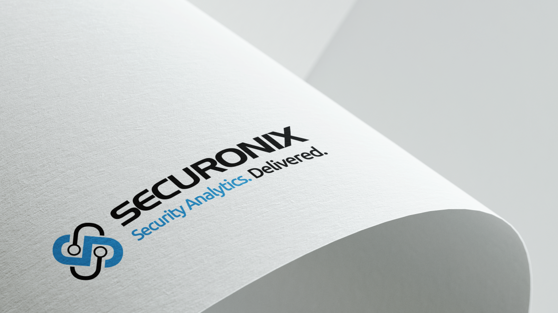
Logo Type
The creation of the company logo type successfully captured their brand values and conveyed their expertise in the technology industry. The logo type became an integral part of their visual identity, contributing to brand recognition and differentiation
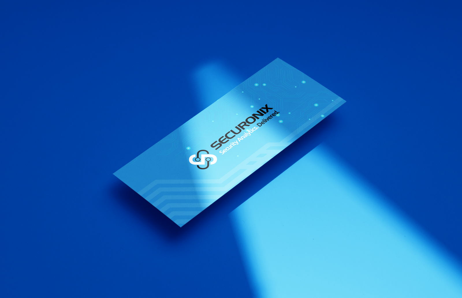
Business Cards
The business card design incorporated Securonix's logo, color palette, and typography to ensure brand consistency and reinforce the company's visual identity. Additionally, it also utilized whitespace strategically to create a clean and professional look.

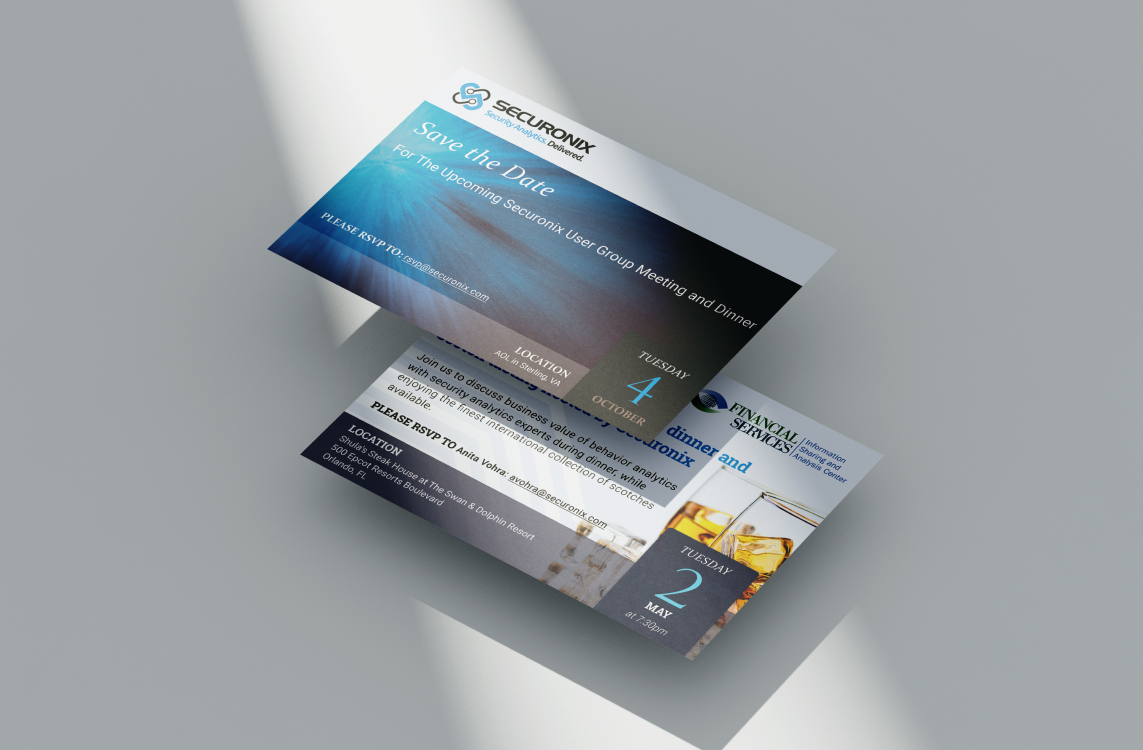
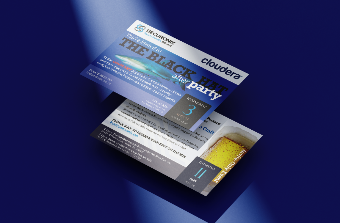
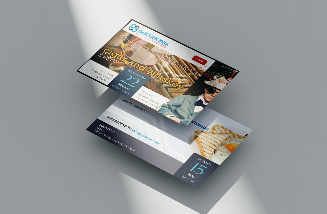
Event invitations
The approach was to explore various design elements, imagery, typography styles and color schemes that aligned with Securonix's branding. The goal was to create a visually appealing and enticing design that would generate interest and excitement.
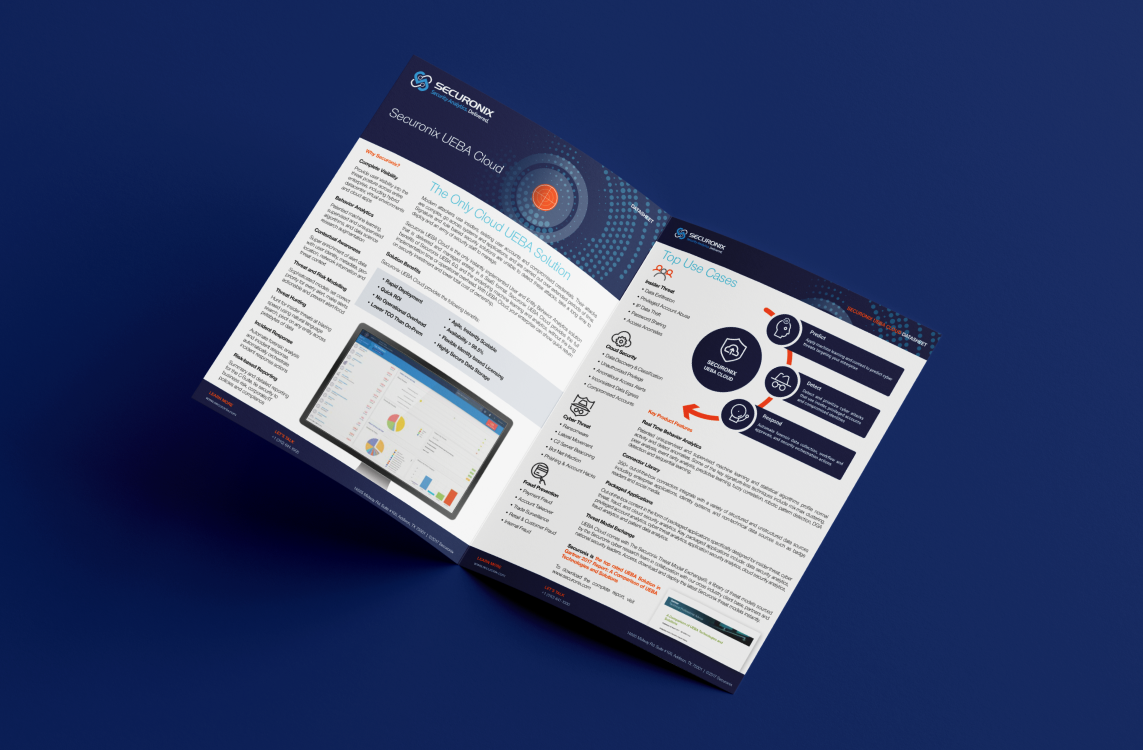
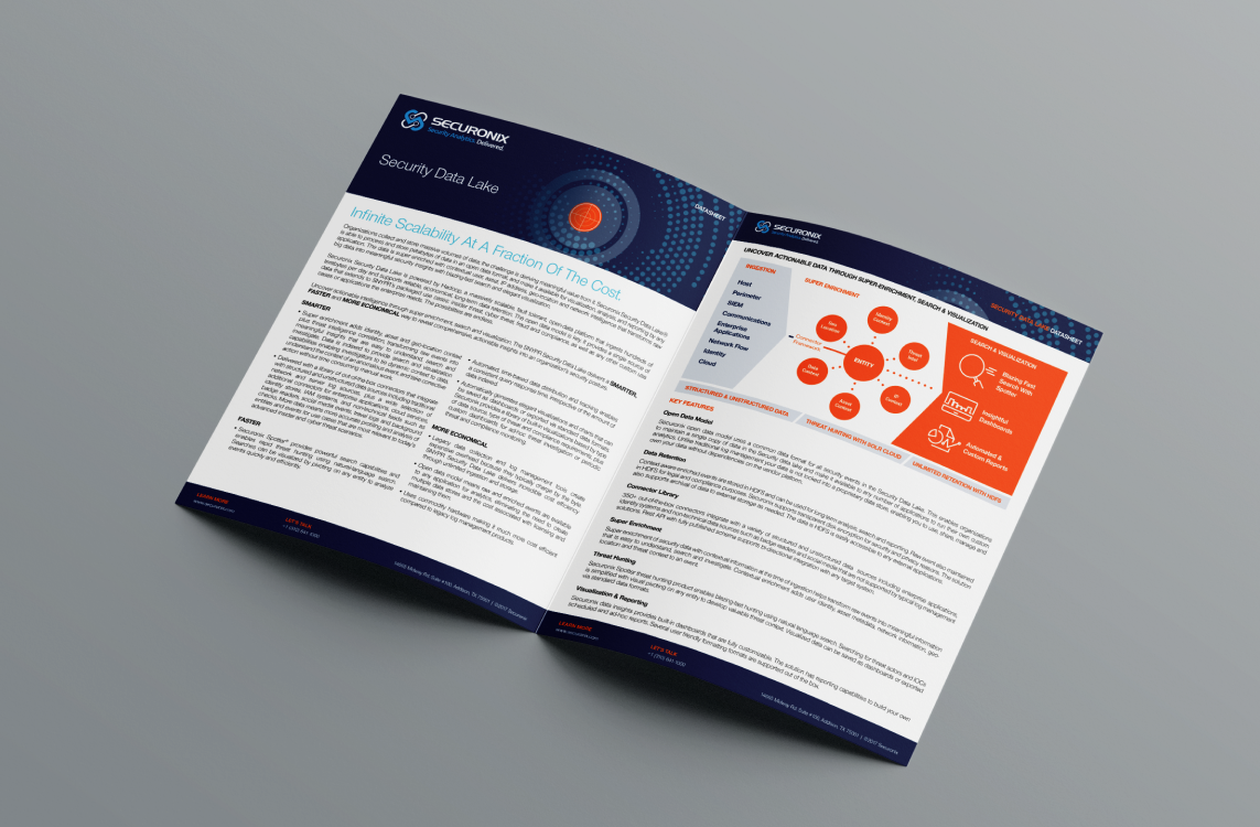
White Papers
The layout and formatting of the white papers were carefully considered to ensure optimal readability. Whitespace was strategically used to create a clean and professional look. The layout was designed to be visually balanced and easy to read, with clear headings and subheadings to guide readers through the content.
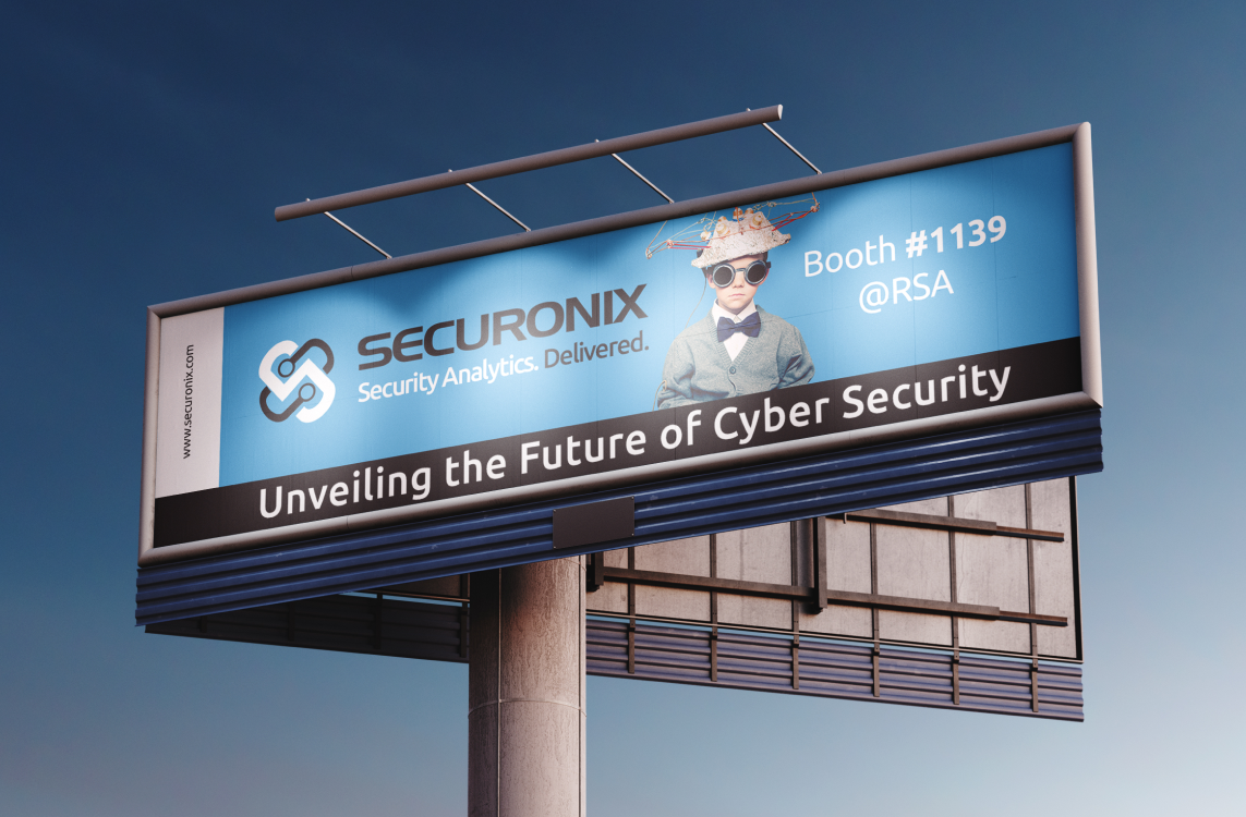
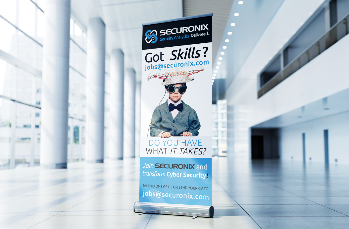
Billboard Ads
To make the ads visually appealing, high-quality images were used or illustrations related to technology or innovation. These visual enhancements were used strategically to create an eye-catching design that would capture the attention of viewers.
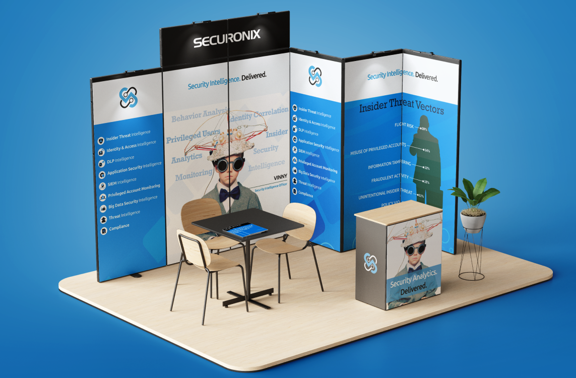
Exhibition Artwork
Working in collaboration with Securonix, we selected a color scheme that aligned with the company branding while also ensuring visual appeal and legibility. The designs featured contrasting colors to create a high-impact appearance that would stand out against the surrounding environment.
THE RESULT
The creation of captivating marketing materials for Securonix successfully reflected their tech focus, innovation, and professionalism. The visually appealing designs, incorporation of technological elements and attention to detail contributed to generating interest and excitement among the target audience, ultimately leading to successful outcomes at the attended events.